The new identity for a truly
smart way to charge your car
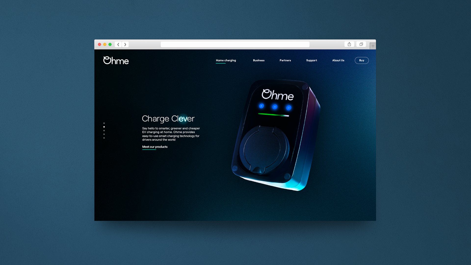
Ohme are leading the mission to speed up the global shift to clean energy, particularly within the EV home charging market. Accelerating the move to electric vehicles by simplifying technology behind the charging process and making it affordable for all through innovation.
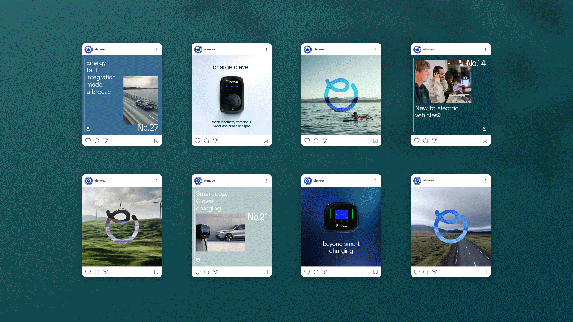
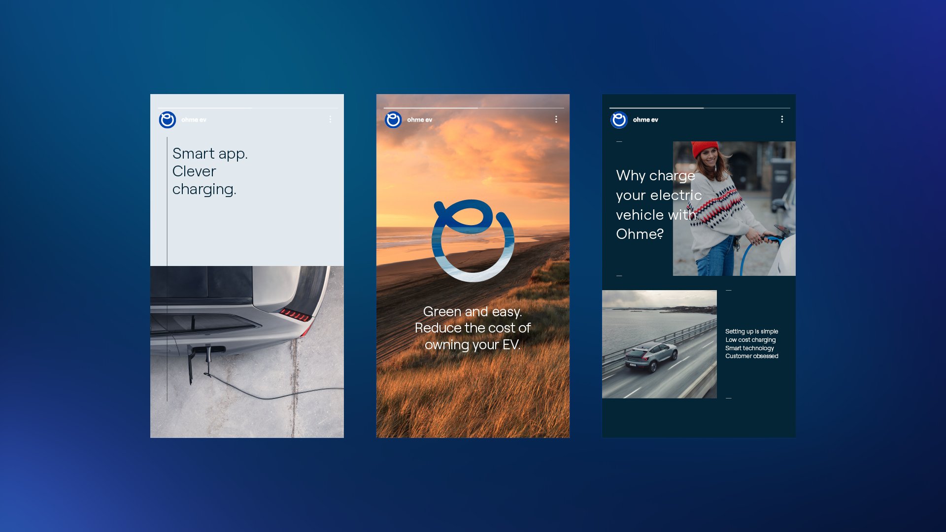
We created a premium visual identity for Ohme, whilst maintaining its friendly and approachable tone of voice. The electric blue glow of energy is paired with a deeper palette of muted blues, greens, and cool greys to reflect the outside world we see from our car. Our brand colours are complimented with a suite of naturally graded film and imagery, each sharing its own story of journey, adventure and destination.
These visuals capture life's moments along the way, offering a glimpse into the experiences and emotions associated with travel and exploration. By incorporating such imagery, the brand not only showcases its home chargers but also establishes a connection with its audience, allowing them to relate to these emotional moments with Ohme by their side.
By employing a clean and concise layout grid alongside Roobert - Ohme's modern geometric brand typeface, combined with ample negative space, the new brand system achieves a natural and calming experience. The grid system provides structure and organisation, allowing elements to align harmoniously and maintain visual clarity, whilst letting messaging to breath in quiet space.
Integrating a premium light and dark suite of product imagery into this mix completes the overall visual identity, fostering an immersive brand experience across all Ohme touch-points including in-showroom displays, social media, posters, print collateral, and brand activations.